It Might Be Time to Rethink the Homepage Carousel
It’s 2015. If your website visitors haven’t been clicking on your homepage slide carousel, they likely aren’t going to start now.
Indeed, rotating slide images are fast being replaced by big imagery, bold visuals, and video. It may not fit every website, but it’s certainly a trend in web design that’s picking up steam. I’ll use our company’s website as an example:

We know that visitors are making decisions quickly once they arrive at your homepage. They’re probably not going to stick around for 30 seconds to watch 7 images rotate through. And when the visitor sees arrows indicating more slides, it removes their incentive to click on the image because it will eventually scroll through. A visitor is much more likely to click on something that describes the destination and gives them a reason to click.
 Some news sites, like CNN, use the carousel effectively by tying the image to a succinct headline:
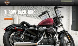
We’ve seen examples of terrific websites that might be losing their visitors’ attention with their slideshow:

In the Harley Davidson example, they are using vibrant, large images – but also have five of them. And it’s not scrolling through. A possible solution for them would be to use the same five images but randomize them, so when the homepage refreshes, a new image is displayed for the user.
We’re certainly not saying that carousels don’t have a place in web design anymore, nor are they entirely ineffective. It just might be time to rethink it as design trends change, and there may be more beneficial options for you to capture your visitors’ attention!
